UI/UX Design: Why It Matters for Your Website's Success
Your website can look professional, load without errors, and still quietly lose potential customers. The problem is often not the service you offer. It is that visitors cannot immediately work out where to go, what to click, or what they should do next.
That is where UI UX design matters. Good design is not simply about making a website attractive. It shapes what people see, how they move through the site, how easily they find information, and whether completing an action feels straightforward or frustrating.
For a business website, those details can affect everything from credibility and enquiries to mobile usability and conversions. Understanding how UI and UX work together can therefore help you judge your website by something more useful than whether it “looks nice.”
What Is UI/UX Design and How Does It Work?
UI/UX can sound like designer jargon when all you really want is a website that customers can use without needing an instruction manual.
UI stands for user interface, while UX stands for user experience. UI design deals with what people see and interact with on the page, while UX design deals with the wider journey and how easy, logical, and useful that journey feels.
What Does UI Design Include?
UI design covers the elements people see and interact with on a website. These include:
- Typography
- Colours
- Buttons
- Forms
- Icons
- Spacing
- Page layouts
- Menus
- Visual hierarchy
A strong interface helps people understand what is clickable, which information matters most, and what action they can take next. Imagine a contact page with three buttons that all look equally important, tiny form labels, and colours that make the text difficult to read. Everything may technically work, but the interface is making the visitor do unnecessary detective work.
What Does UX Design Include?
UX design looks beyond individual buttons and colours to the experience as a whole. It considers questions such as: Can visitors find the right service? Does the navigation make sense? Are pages organised logically? Can someone complete an enquiry without getting stuck? Does the website work comfortably for people using different devices or accessibility tools?
This includes how information is organised, how visitors move from one page to another, how easy the site is to use, and whether people can complete important tasks without unnecessary difficulty. For example, someone visiting an accounting firm's website may want to find corporate tax support, understand whether the firm works with businesses like theirs, and arrange a consultation. Good UX makes that journey feel obvious rather than forcing the visitor to search through unrelated pages.
How UI UX Design Brings the Two Together
UI and UX are different, but they depend on each other. Suppose a visitor is ready to book a consultation. UX determines where that option belongs in the journey and what information should come before it. UI determines whether the button is recognisable, visually prominent, and consistent with other interactive elements.
A site can be visually polished and still be frustrating to use. It can also be logically structured but still feel clumsy if the interface is inconsistent or difficult to read.
UI and UX Design: What Is the Difference?
It is easy to lump UI and UX together because they usually contribute to the same website experience. The useful distinction is what each discipline is trying to solve.
UI Design Focuses on How the Interface Communicates
UI design helps users interpret what is happening on the screen. A button should look clickable, an error should be clearly different from a confirmation, and a primary call to action should carry more visual weight than a secondary link.
In practical terms, UI design covers how the website looks and behaves on the screen, including typography, spacing, layouts, buttons, forms, and how those elements adapt across different devices.
UX Design Focuses on How the Journey Is Structured
UX design asks whether the website's structure supports what people came to accomplish. That can involve understanding what visitors need, deciding how information should be organised, testing whether navigation works, and improving the steps people take to complete important actions.
For example, UX may determine how ten service pages should be grouped and labelled, while UI determines how those choices are presented. The two overlap throughout the design process because both need to support the same user goal.
Why UI UX Design Matters for Website Success
Your visitors rarely arrive thinking, “I hope this website has excellent UX.” They simply notice when something feels confusing, slow, awkward, or harder than it should be.
Good UI UX design removes those unnecessary obstacles. For a business website, that can influence usability, trust, decision-making, and the likelihood that an interested visitor takes action.
Better Usability Makes It Easier for Visitors to Act
Every extra moment a visitor spends figuring out the website is attention they are not spending on your business. Clear navigation, recognisable controls, scannable pages, and predictable interactions reduce cognitive load. Visitors have fewer things to work out before they can get what they need.
If someone has to guess whether “Solutions,” “Expertise,” or “Capabilities” contains the service they want, the website has already created unnecessary work. Margined makes a similar point in its own approach to web design and SEO, recommending clear service descriptions instead of vague labels such as “solutions.”
Straightforward labels such as “Accounting Services” or “Corporate Tax” may be less creative, but they are easier to interpret. If a first-time visitor cannot find a service without guessing where it is hidden, that is useful feedback about the website, not a failure on the visitor's part.
Good Experiences Build Credibility and Trust
A prospect may know very little about your company when they first arrive. Your website therefore becomes part of the evidence they use to decide whether you seem credible. Research from Stanford's Web Credibility Project found that visual design influences how people assess website credibility, while usability and usefulness also contribute to trust.
For professional services businesses, that credibility check carries extra weight. Margined describes the website as part of the evidence visitors use to decide whether a firm feels clear, trustworthy, and capable before they make contact.
If you are asking someone to trust you with their finances, legal affairs, business strategy, or another high-stakes decision, the digital experience should reinforce that sense of competence.
Strong Visual Hierarchy Helps People Find What Matters
Visitors generally do not give every word and every element on a page equal attention. They scan, pick up cues, and decide what deserves a closer look. Visual hierarchy uses heading size, spacing, contrast, positioning, typography, and other interface elements to establish those priorities.
The page should make it easier to distinguish the main message, supporting information, and next action. When everything is large, bright, animated, or labelled “important,” nothing really looks important.
A Better Experience Can Support More Conversions
McKinsey's research into the business value of design tracked 300 publicly listed companies over five years. Companies in the top quartile of its Design Index recorded revenue growth 32 percentage points higher and total shareholder return growth 56 percentage points higher than industry peers.
That does not mean changing a button will magically increase revenue. Your positioning, offer, pricing, traffic quality, and copy still matter. Better UX simply reduces the chance that the website itself gets in the way of someone already interested.

How UI/UX Design Can Improve Website Conversions
A conversion is not limited to an online purchase. For many business websites, the conversion may be an enquiry, consultation booking, quote request, phone call, download, or newsletter signup.
Once someone is ready to act, the website should make that action easy to understand and complete.
Reduce Friction at the Point of Action
A prospect can understand your offer perfectly and still leave because completing the next step feels like work. Common friction points include forms that ask for too much information, contact details that are difficult to find, unclear instructions, or too many steps before an enquiry is submitted.
Consider a consultation form asking for 15 pieces of information before someone has even spoken to the business. If several of those details could easily be collected later, the form is demanding effort too early. Visitors may also hesitate if they do not know how quickly someone will respond or what happens after they submit their details.
Decision overload can create the same problem. If a service page presents several packages, multiple CTAs, and different contact routes without helping the visitor understand which option suits them, the page may make the decision harder instead of easier.
Of course, not every conversion problem is a UX problem. A visitor may also leave because the offer is unclear, the pricing does not suit them, or the page has failed to establish enough confidence. Good UI/UX helps people act on existing interest, but it cannot fix an offer they do not want.
Make Calls to Action Easier to Understand
A button being visible does not automatically make the next step obvious. The wording, placement, context, and visual prominence of a call to action all influence whether visitors understand what will happen next.
“Book a Consultation” is more specific than “Learn More” when the intended action really is to speak with someone. Too many competing CTAs can cause the opposite problem, making every choice seem less important.
Good call-to-action design makes the intended next step easy to recognise without competing with the rest of the page.
Common UI/UX Problems That Hurt Business Websites
Bad UX is not always dramatic. More often, it appears as a series of small irritations that the business has stopped noticing because its own team already knows how the site works.
Your visitors do not have that advantage.
Visitors Cannot Tell What the Business Does
A homepage can have professional photography, attractive typography, and smooth animations while failing to answer the most basic question: what does this company actually do?
Vague hero statements and internal company language are common culprits. A slogan such as “Transforming Possibility Into Tomorrow” might sound polished, but a new visitor still needs to know whether you provide tax advice, software development, consulting, or office furniture. Design should support clear communication, not force visitors to decode it.
Navigation Makes People Work Too Hard
Navigation tends to disappear into the background when it works well. When it does not, visitors notice very quickly.
Common problems include:
- Too many menu options
- Ambiguous labels
- Important pages buried several levels deep
- Inconsistent navigation between pages
- Services grouped according to internal departments rather than customer needs
Visitors should not have to learn your organisation chart before they can find what they want.
The Website Has Too Many Competing Elements
More visual activity does not necessarily mean more engagement. Pop-ups, banners, moving backgrounds, multiple button styles, promotional boxes, notifications, and animations can all compete with the page's actual purpose.
Even useful elements become distracting when everything demands attention at once. Good visual design involves deciding what not to emphasise as much as deciding what to highlight.
Mobile Usability Feels Like an Afterthought
Responsive web design should also do more than squeeze the desktop layout onto a smaller screen. Mobile users need readable text, comfortable tap targets, practical forms, straightforward menus, and sensible content priorities.
Smaller screens force harder choices about what appears first. Good mobile UX prioritises the information and actions most likely to matter while keeping secondary content within reach.
Google recommends looking at the website experience holistically, including whether content displays well on mobile devices and whether intrusive elements interfere with the main content.
Pages Look Good but Do Not Support User Intent
A visually polished service page can still fail if it never answers the questions a prospect actually has. Imagine a consulting page full of impressive imagery and brand statements but no clear explanation of who the service is for, what problem it addresses, or what happens after someone enquires.
Margined approaches this by planning search intent, website structure, content, design, and conversion together. Its own guidance says search intent should inform the pages being built, while design should support clarity and trust, and SEO should be incorporated into the site structure rather than added later.
That is the difference between designing a page around the business and designing it around the visitor.
UI UX Best Practices for Business Websites
There is no universal layout that guarantees good UX. What works for an ecommerce store may make little sense for an accounting firm.
Still, several UI UX best practices consistently make business websites easier to understand and use.
Start UI UX Design With the User, Not the Decoration
Before choosing colours or debating button shapes, identify who is visiting and what they need to accomplish. Think about who your key visitors are, why they arrive on the site, which information they need, which tasks matter most, and what could prevent them from completing those tasks.
User personas, task flows, analytics, interviews, and user research can all help. A simple test can already tell you a lot: ask someone unfamiliar with the business to find one service or specific piece of information, then watch where they stop, hesitate, or take an unexpected route.
Keep Navigation and Page Structure Predictable
People bring expectations from thousands of other websites. You usually benefit from those expectations rather than fighting them.
Navigation should use understandable language, similar pages should behave consistently, and related information should be grouped logically. This does not mean every website should look identical. It means creativity should not come at the cost of making basic interactions unnecessarily difficult.
Design for Accessibility From the Beginning
Accessibility is not a niche consideration. The World Health Organization estimates that around 1.3 billion people, or 16% of the global population, experience significant disability. (who.int)
The W3C's Web Accessibility Initiative explains that poorly designed websites can create barriers that make digital content difficult or impossible for some people to use. Accessible design can include readable text, sufficient contrast, keyboard access, properly labelled forms, useful alternative text, and interfaces that work with assistive technology.
Accessibility and usability overlap because both are concerned with whether real people can actually use the website.
Give Users Clear Feedback
When someone interacts with the website, they should not have to wonder whether anything happened. A form should confirm when it has been submitted, an error should explain what needs fixing, and a loading state should indicate that the system is working rather than frozen.
This principle is well established in usability research. Nielsen Norman Group's usability heuristics place visibility of system status first, noting that keeping users informed helps them understand the current state and make appropriate decisions.
Test Instead of Assuming
The longer you work with your own website, the harder it becomes to experience it like a new visitor. Usability testing, analytics, form-completion data, user feedback, and observed session behaviour can show where people struggle.
Instead of relying on what the team expected visitors to do, look for patterns across multiple sources before deciding what needs to change.
How UI UX Design Fits Into the Web Design Process
UI/UX should not be something you sprinkle onto a website shortly before launch. Many of the most important experience decisions happen before the final interface is designed.
Margined's own process reflects that. Its approach moves from Discover & Define, through Concept & Create and Refine & Optimize, to Launch & Support. Audience analysis, wireframing, design, development, testing, and post-launch measurement all sit within the same process.
Research and Website Strategy
Before deciding how a page should look, establish what the website needs to accomplish. That includes understanding business goals, target audiences, visitor intent, competitors, content requirements, and the actions the site should encourage.
Without this stage, design decisions tend to be based on personal preference rather than what customers actually need.
Information Architecture and User Flows
Information architecture determines how the website's content is organised, including the sitemap, page hierarchy, menu structure, service categories, and relationships between pages.
User flows consider how someone moves between those pieces of information to complete an important task. Planning that route before designing screens can prevent structural problems later.
Wireframes, Design, and Refinement
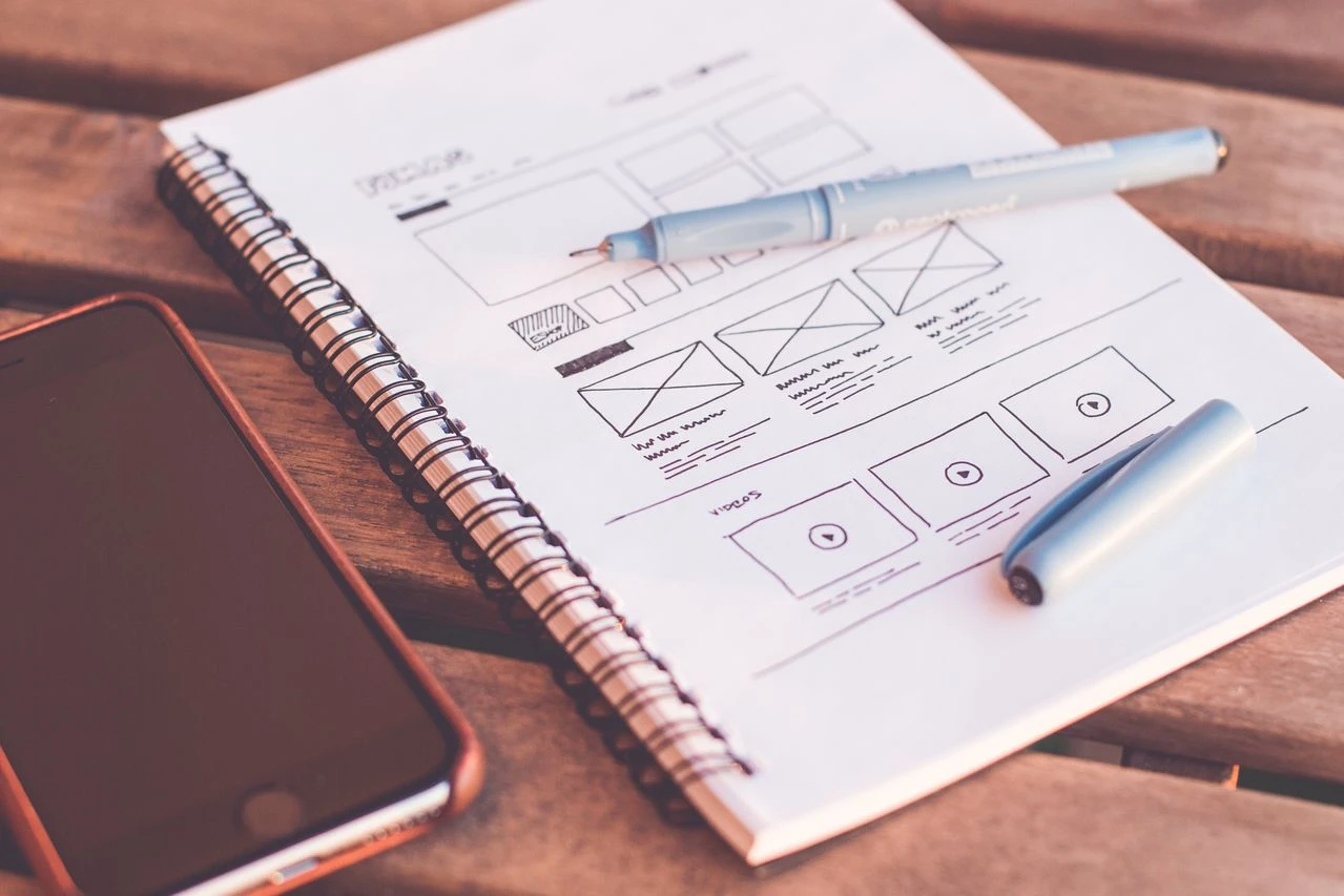
A wireframe is essentially a simplified plan of a page. It helps test content priority, page flow, and CTA placement before finished visual styling takes over. Once the structure is clear, visual design and development turn those decisions into a functioning website.
Margined's process continues after launch with performance testing, behaviour tracking, engagement monitoring, ongoing updates, and performance analytics. Real behaviour can reveal problems that were not obvious during design.
Does UI UX Design Affect SEO?
It is tempting to say that “better UX means better rankings,” but the relationship is more nuanced.
UI/UX can support SEO and make organic traffic more valuable, but it does not replace relevant content, technical SEO, crawlability, or search intent.
Website Performance and Core Web Vitals
Design decisions can affect site performance, especially when pages rely on oversized images, unnecessary scripts, complex animations, or unstable layouts.
Google's current Core Web Vitals guidance recommends aiming for:
- Largest Contentful Paint within 2.5 seconds
- Interaction to Next Paint below 200 milliseconds
- Cumulative Layout Shift below 0.1
These metrics cover loading performance, responsiveness, and visual stability. Google recommends good Core Web Vitals for Search success and user experience, but also makes clear that perfect scores alone do not guarantee top rankings.
Core Web Vitals measure specific technical aspects of page experience. Clear navigation, useful content, credibility, and sensible page structure affect how people use the site after they arrive, but those qualities are not automatically direct ranking factors.
Clear Site Structure Helps People and Search Engines
A logical site structure can benefit both users and search discovery. Clear navigation, descriptive page hierarchies, sensible internal links, and well-organised content make it easier for visitors to orient themselves and can help search engines interpret relationships between pages.
Margined describes the same issue as treating the website as one system, with structure, content, design, and conversion working together. When those pieces are separated, you can end up with a site that looks good but gets little search visibility, or a site that attracts traffic but fails to generate enquiries.
Google's current guidance for generative AI features in Search points in the same direction. Conventional SEO fundamentals remain foundational, with the emphasis on valuable, unique, non-commodity content rather than separate “AEO” or “GEO” hacks.
How to Tell If Your Website Has a UI/UX Problem
Because you already know your own website, you may automatically compensate for things that would confuse someone seeing it for the first time.
Try evaluating it from a visitor's point of view:
- Can a first-time visitor explain what your business does within a few seconds?
- Is the main navigation easy to understand?
- Can visitors find important services quickly?
- Is there a clear next step on key pages?
- Does the website work comfortably on mobile?
- Are forms easy to complete?
- Can visitors tell what happens after they submit an enquiry?
- Does important content stand out?
- Does the overall experience create confidence in your business?
Several “no” answers do not automatically mean you need to throw away the entire website. They do suggest that its problems may go beyond changing a few colours.
There is also a useful low-tech test. Give someone unfamiliar with the website a specific task, such as finding a service and starting an enquiry. Do not tell them where to go. Watch where they pause, backtrack, click the wrong thing, or ask for help. Those moments can reveal problems that the business itself no longer notices.
How a UI UX Design Abu Dhabi Partner Can Support Website Success
If your self-assessment reveals bigger structural problems, choosing a designer based solely on which portfolio looks prettiest can miss the point.
A capable UI UX design Abu Dhabi partner or web design studio should be able to connect design decisions with your customers and business goals. That means understanding your goals, researching user needs, planning site structure, considering responsive design and accessibility, mapping conversion journeys, and testing the experience before and after launch.
The important question is not simply, “Can they make this look modern?” It is whether they can explain how the proposed changes will make the website clearer, simpler to navigate, and better suited to the actions you want visitors to take.
What Is the Difference Between UI and UX Design?
UI design focuses on the interface people see and interact with, while UX design focuses on how the overall journey is organised and how easily users can complete important tasks. In website design, UX shapes the path while UI makes that path clear and usable.
Why Is UI/UX Design Important for a Website?
UI/UX design helps visitors understand and use your website more easily. Clear navigation, sensible page structure, readable content, accessible interfaces, and straightforward calls to action can reduce unnecessary friction and make the site more useful to people who are already interested in what you offer.
Can UI/UX Design Improve Conversion Rates?
Good UI/UX can improve the conditions for conversion by removing obstacles such as confusing forms, unclear CTAs, difficult navigation, and unnecessary steps. However, your offer, messaging, pricing, audience, traffic quality, and credibility also affect conversion rates.
Sources
- Stanford Web Credibility Research — Guidelines for Web Credibility
Stanford Web Credibility Research - McKinsey & Company — The Business Value of Design
McKinsey: The Business Value of Design - World Health Organization — Disability and Health
WHO: Disability and Health - W3C Web Accessibility Initiative — Introduction to Web Accessibility
W3C: Introduction to Web Accessibility - Nielsen Norman Group — 10 Usability Heuristics for User Interface Design
Nielsen Norman Group: Usability Heuristics - Google Search Central — Understanding Core Web Vitals and Google Search Results
Google: Core Web Vitals - Google Search Central — Page Experience in Google Search Results
Google: Page Experience - Google Search Central — Google’s 2026 Guidance for Optimising for AI Search Features
Google: AI Search optimisation guidance
Final Thoughts
UI UX design plays a major role in how well your website supports both your visitors and your business. A polished appearance is only part of the equation. People also need to understand what you offer, find the information they need, move through the site comfortably, and take the next step without unnecessary friction.
That means treating appearance, structure, accessibility, responsive design, content hierarchy, user journeys, and business goals as connected parts of the same experience. Margined takes a similar approach by bringing structure, content, design, and conversion together rather than treating them as separate website tasks.
If your website looks professional but still feels difficult to navigate, generates fewer enquiries than expected, or no longer supports the way your business works, contact Margined Studio. The team can help you rethink your website as a complete experience and create a web design strategy that is clearer, easier to use, and better suited to the people you want to reach.

.webp)